CSS button hover effect
A pure CSS button hover effect that creates smooth sliding animations using pseudo-elements and transform properties.
- animation
- hover
- button
- css
- transition
Highlights
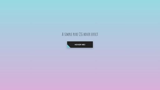
Pure CSS Pseudo-element Sliding Hover Effect: Perfect Combination of Transform and Transition
- Uses ::after pseudo-element to create a sliding background layer
- Implements diagonal sliding effect through transform: translateX() and rotate()
- Utilizes transition property for smooth animation transitions
- z-index layering control ensures text always stays on top
Deep dive
Core Technical Implementation
This button hover effect cleverly uses CSS pseudo-elements and transform properties to create visually striking interactive effects.
Key Technical Points
1. Pseudo-element Background Layer
- Uses
::afterpseudo-element to create an independent background layer - Sets
position: absolutefor absolute positioning - Initially hides the background layer on the left side of the button through
translateX(-98%)
2. Transform Effects
translateX(): Controls horizontal displacement for slide-in/slide-out effectstranslateY(-25%): Vertical offset combined with rotation to create diagonal effectsrotate(45deg): 45-degree rotation forming diagonal sliding visual effect
3. Smooth Transition Animation
transition: all .5s ease-in-outprovides 0.5-second eased transitionease-in-outeasing function ensures more natural animation start and end
4. Layer Control
- Button text uses
position: relativeandz-index: 1to ensure it always displays on top - Pseudo-element background layer stays below without blocking text content
Visual Design Highlights
- Gradient Background: Page uses linear gradient
linear-gradient(to top, #d9afd9 0%, #97d9e1 100%)to create elegant background - Shadow Effect:
box-shadow: 0 5px 15px rgba(0,0,0,0.20)adds depth to the button - Font Choice: Uses Google Fonts 'Amatic SC' to enhance design aesthetics
Reuse steps
- 1Create basic button HTML structure with span tag wrapping text content
- 2Set button base styles: position: relative, overflow: hidden, and required padding and colors
- 3Add ::after pseudo-element with absolute positioning and initial transform values (translateX(-98%) translateY(-25%) rotate(45deg))
- 4Add transition property to pseudo-element and modify translateX value on :hover state to achieve sliding effect
Performance notes
Uses transform instead of changing width/left properties to avoid triggering layout reflow and improve animation performance; properly controls pseudo-element dimensions (height: 490%, width: 140%) to ensure complete button area coverage without over-rendering